Showing posts with label decorating. Show all posts

Tuesday, December 4, 2012

Christmas Decorating in Progress

 
(Fabric wreath with a fringe of faux berries)

Taking out the boxes of Christmas decorations is such a treat.  Since I  buy decorations at after Christmas sales, I forget what I have and enjoy the surprise discovery.  But something weird is happening this year; I've been sending more more and more of my treasures junk to Goodwill and adopting a less-is-more approach. 

 I like little unexpected touches, like the accessories on my birds and some greenery in my shoe last:


I'd like my white Christmas confined to inside the house.  I spray-painted some candle holders and pillar candles and gave the candles a sprinkle of coarse clear glitter.  Add a few sprigs of holly from The Dollar Store for some color , add some white lights and my white tablescape works for me.


Same treatment for craft paper trees - white paint, a wash of diluted glue and some more of the clear glitter and a bit of gold.  I found the candle bottom thingies at the thrift store and gave them a shot of gold glitter paint.


My favorite decorations are lights - I love the glow of those little white lights, especially since it gets dark at 4 in the afternoon!  Perfect view for enjoying with my first cup of coffee!


Getting our tree this weekend - our goal once again is a smaller tree that doesn't require us to move out half the living room furniture!


Thursday, October 11, 2012

Falling Leaves Collage and The Great Bittersweet Harvest


"October gave a party -
the leaves by hundreds came."

~  George Cooper
 
 
I learned this George Cooper poem in third grade.  Not sure why I'm still using valuable brain storage space on this when I can't remember what I had for lunch yesterday!  But I digress; I want to share a fall-inspired collage.
 
 
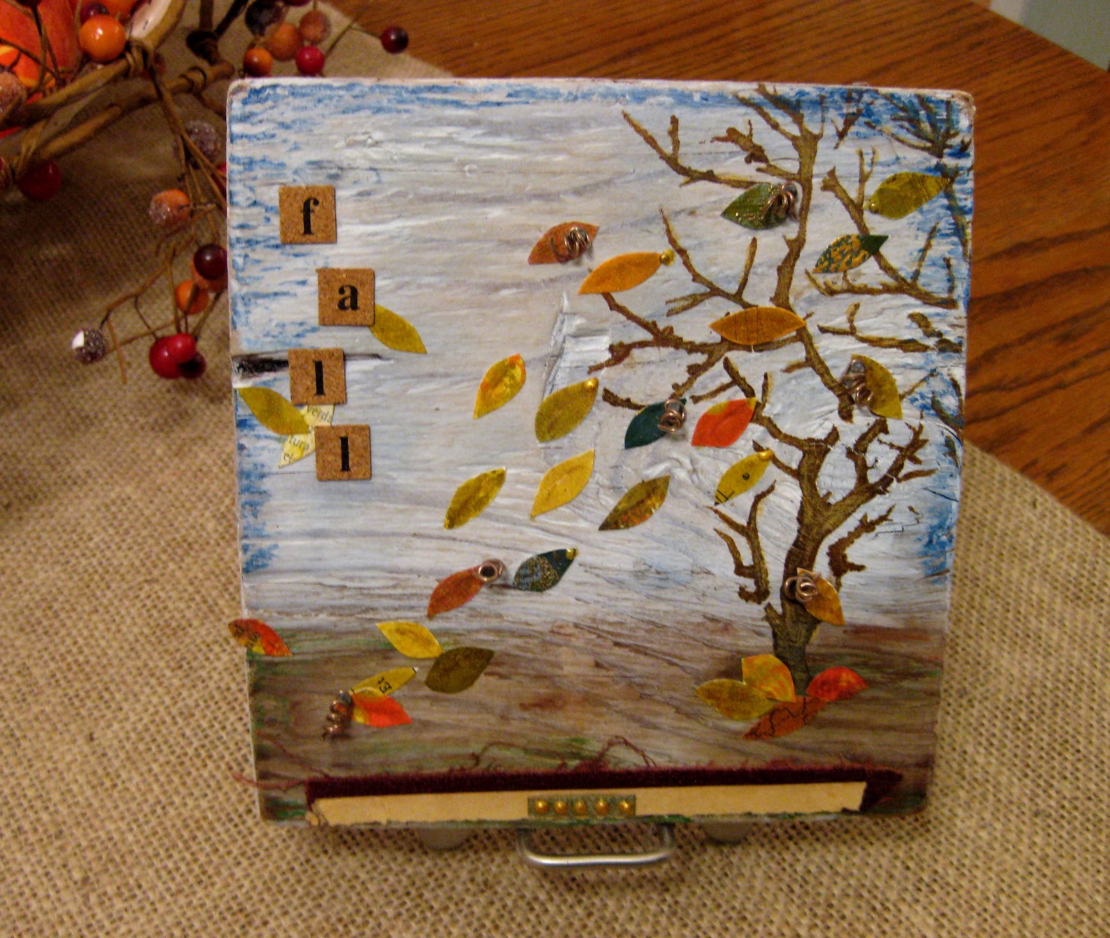
I found this little (about 6 inch square) piece of wood on the beach and knew it had potential.  This is the first time I've ever done any art work on wood and it was fun - banging nails is so therapeutic!


I washed on some diluted acrylic paint and added some extra color with oil pastels around the edges.  The stenciled tree was done with acrylic paint.  I cut out leaves from various fall-colored papers.  The fun part was banging in small nails on the leaves and adding some curled wire .  A small piece of torn book binding along the bottom adds some grounding.
 
I kept coming back to work on this, thanks to the advice from Claudine Hellmuth's class.  The leaves seemed too bright, so I went over them with a Tumbled Sage Distress Ink pen.  The tree was too dark and all one shade of brown, so I scratched over it with a raw sienna watercolor pencil. 
 
On to bittersweet -  I know that bittersweet is considered an invasive species, but I can't resist those red berries with their orange cases and all those twirly vines. 


My car, filled with a haul of bittersweet.
 
 
The Captain - bittersweet whacker in chief.  It's hard to see in this picture, but the branch he's holding has a bonus - an empty bird nest ! 
 
 
Now some people might call this crazy, but I told you I love bittersweet.  Here's that branch, sporting its birdie nest and announcing that fall has come to the dining room.
 

Bittersweet in the cloche.  Don't you love this little white pumpkin all blinged -out?

Thursday, October 4, 2012

Family Room Upgrade

Our family room style could best be described as eclectic hodge-podge.  Whatever didn't work anywhere else ended up in the family room.  So here you have it (and proof I have no shame by sharing this crime-against-decorating!):

 
Let's talk about the futons.  When The Captain and I were first married we went to get new covers for his old futons.  Having taken temporary leave of my sanity, I asked him what he'd like. When he said "Southwestern", did I say that I think the only time you can get away with geo-specific decor is if you actually live in the region that inspired the style? Did I say that bright, bold geometric  prints make me nervous?  No, what I said was that I thought it  was a great idea- best ever! After coming to my senses,  I tried with some equally hideous floral print covers that didn't hold up, so the Southwest rose again.
 
 
Enter duvet covers for the futons - and thrifted for $15.00.  Why didn't I think of this years ago? 
New covers, new color scheme - white, blue and tan and things are so much better.
 
 
This little table really started the project.  The Captain spied it on the curb while walking and the price was right - free.  I can't find the "before" picture I know I took, but you've seen lots of these little maple tables.  Some serious sanding, painting and distressing brought this table out of colonial and into cottage.  Now I knew what I needed to do with the rest of the room - all the odds and ends needed the white paint treatment.
 
 
Next up - this coffee table.  Gold-ish metal bottom, natural baskets and pine top - all have to go.
 
 
I sprayed painted the metal bottom and baskets.  After sanding the top, I gave it a white-wash of diluted white paint for a faux vinegar paint look.  This makes a better TV stand than the old green one.
 
I bought the big turquoise frame at an estate sale. I toned it down with a wash of white paint and added my newly distressed frames.
 
 
My painted frames found the perfect spot.


The tray top of this hassock was black and with a coat of white paint it makes the perfect end table for the bigger futon.
 
 
Newly painted bookcase and a mirror from another estate sale spruce up this spot.  I made the curtains awhile ago.  I wanted to use the branches as curtain rods, but that meant I couldn't run the curtain tabs through the branch with all those twigs through the loops,  so I  looped the tabs  over the branches and secured them  some big buttons from my stash.
 
 
A fun tag sale shelf, newly reframed shell pictures and a jar of mussel shells for some more blue, tan and white 
 
 
.
I made a few pillows to bring in some patterns - more on these later.


To recap - from this:
 
 
To this:


Looking at this picture, think I need to move out the wooden chair as it looks pretty cramped along that wall.,  But so happy with the color palette and the duvet-turned futon covers.  Shabby cottage- at the- beach trumps  Southwestern hodge-podge !
 

Sunday, June 3, 2012

Tablescape


The Captain and I just got home from Scotland (much more on that later!).  We had a great trip, and as always, there is a point when I'm on vacation that I'm ready to come home.  My head is swirling with new project ideas and I feel  lost after so many days with no creative outlet. Vacations aren't just a time for new experiences; I always come home all fired up with things to do.

Practical things had to take first place - like mountains of laundry, weeds apparently on crack that have taken over the gardens, and over 1,000 pictures( there's no success like excess!)  to edit and organize.  Then there's that jet-lag problem - I've been falling asleep early and waking up at 4 a.m.  I was weeding at 5 a.m. yesterday - the neighbors are beginning to wonder!

But today I had fun making a new tablescape for our dining room table. I've had the Pottery Barn runner and love the text and images.   I used things that speak to my obsessions - old mirrors, shells, letters, stones and bird nests.   I started with an old mirror as a base since I like to be able to pick up all the doo-dads at once when we need to use the whole table.  You get a two-fer using a mirror with the reflected image - a nice bonus!

I separated the nest from the candlestick  base and added a small glass candlestick to it to  hold some limpet shells I collected on a beach in Scotland.  The pottery heart was a find from Paris.


I love Scrabble tiles and use them in art projects, but never thought about displaying them.  I had to play around with them in this beaker.  At first I just dumped them in and for some reason, most were turned to the blank side- go figure!


We live near the beach and it's hard to resist smooth, flat beach stones.  I embellished these - one with a stamped star, one wrapped in a strip of dictionary page and one wrapped with twine.

Feels good to be making things!

Sunday, May 6, 2012

Kitchen Tour Ideas


We're in the thinking stage of changing out our kitchen counter tops.  By thinking, I mean that The Captain is approaching this by logical investigation and comparison shopping, and I'm freaking out.  We have lots of counter top space - 70 square feet - and I'm afraid of making a big, expensive mistake! 

He bought tickets to the Newcastle Kitchen Tour and yesterday we traipsed through some absolutely gorgeous kitchens.  Newcastle is a small town on the water and  home of  the highest per capita income in the state, making it the perfect place to check out fancy-schmancy kitchens. 

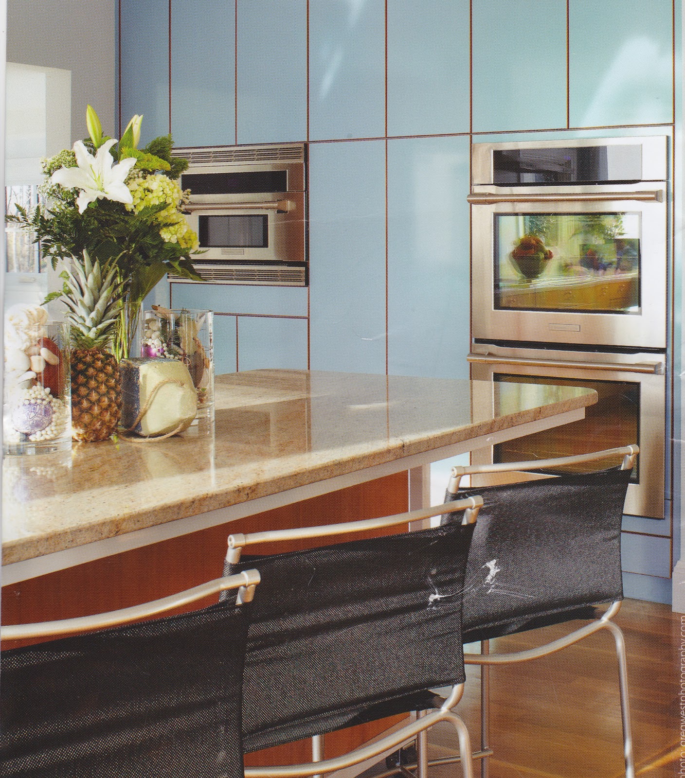
All the kitchens were professionally designed , so it was a chance to "second -hand" shop their great ideas.  Sadly, there was a "no photographs allowed" rule, so I only have a few pictures from the brochure:


I do love this all-white look - and the window shades- and the drawer pulls!


Interesting wall of cabinets without hardware - out of picture range are two large suction cup knobs that you move to whatever cupboard you need to open!

All of the houses were stunning, most were new or newly renovated.  A couple of colonial-era homes were on the tour and it was interesting to see how very old, very small kitchens were transformed and yet kept their old-world charm.

I noticed a few themes:

     *  All of the houses  except one had granite counter tops (the hold-out had soapstone). 
     *  Most houses had large islands
     *  Most had large deep, single sinks
     *  All had lots of light - either natural or artificial
     *  Window treatments were absent or minimal
     *  All had minimal clutter - counters were pretty bare
     *  Most had light colored cabinets - either light wood or painted white

We learned a couple of things - that my idea of having the stove island done in butcher block has been done and looks fantastic.  Check it out in the photo above. 

Another good idea - the off center faucet, like this one from Young House Love:


On the way home, we checked out some counter top options.  I like the idea of granite, but not the highly polished look.  The aged, "leather" finish is nice - matte with some texture:


 I also saw some Corian I liked and love the one piece sink option, plus the no-seam finish.  While it costs as much as granite (at least the color I like does), it doesn't have the instant pedigree of granite!  This is Corian Verde:


And with the Corian one-piece sink:


More searching, more looking, more investigating before taking the plunge.  Any suggestions?


Wednesday, January 25, 2012

Another Pottery Barn Knock-Off


I love these numbered jars from Pottery Barn.  It dawned on me that I already HAD jars so making these would be easy and {gasp} require no new supplies!

Here's what I used:

Black acrylic paint, cosmetic sponge, stencil, tape and glue to secure stencil to glass.  Really simple project - decide where you want the numbers, tape on the stencil and sponge on black paint.  I tried some repositionable glue to help keep the stencil flat, but it didn't stick very well.  Taping kept the stencil secure and I just held down any areas that wouldn't stay flat.

The paint on the PB ones looks a bit scrubbed up.  My stencils didn't have  smooth lines and the cosmetic brush left a nice texture, so I didn't do any additional distressing.  If your stencil had really clean edges and your painting isn't textured, you could dab off some paint with a paper towel and scratch it up a bit with something sharp. 

Here are my knock-offs:

The jars are Burken jars from Ikea.  They  come in many sizes and have silicone inside the lids so there is a pretty decent seal. I use them for all kinds of storage.

Isn't the little guy  - "1/2" cute?  I smile every time I see it!  Love my new PB-inspired jar upgrade.

Friday, July 15, 2011

Coastal Decor


I'm redoing our guest room, the former man-cave of our youngest son.  Since many of our guests don't live near the ocean, I decided to give the room a full-on beach-y feel.  I'm not usually a fan of "theme" rooms, but since we live very close to the ocean, we have the street beach-cred to pull it off. 

I found lots of inspiration at one of my favorite blogs, Completely Coastal.  This site is full of wonderful beach decor and ideas for using all those shells and beach treasures.   Then flipped through the Pottery Barn catalog for more ideas.  It's no secret that I love their ideas, but not their prices!  Like many crafty-types, I look at their stuff and my first thought is, "How cool is that" and my second is, "I can totally make that!" 


I've seen these bottles in very pricey catalogs - these are from Wisteria.  These shells are soldered on and that's beyond my capabilities, but I thought I could recreate this look.  I started out by gluing paper "caps" onto the bottle tops to avoid having the "solder" drip into the bottle.  I used grout for the solder and was glad I had the little top on - it gave a firm platform and did prevent droppings inside the bottle.  I swirled it onto the bottle top, and frankly, it looked pretty rough.  Once it dried a bit, I was able to pat it smooth and make it follow the contours of the bottle.


I painted the grout dark blue - thought the black was too harsh for my color scheme and then glued on the shells.  I couldn't resist adding a tag to one and wrapped one with twine.


Love my free shell bottles!

Next a Pottery Barn knock-off based on these lanterns from PB.  Boston Daughter bought this lantern for me and now it have been PB-ized:


I saw this somewhere and can't remember which chi-chi catalog.  This one was easy - wrapped a glass cylinder with burlap and then tied on some muslin-stamped ribbon I made.  Some sand, a candle, shells and done.


Stay turned for the big reveal!


Tuesday, February 22, 2011

It"s Award Season!


Whooeee, it's time for all those la-dee-dah dresses (and more than a few dogs), for seriously tailored suits on leading men, and the little golden statue given to the winners. Turns out I got an award of my own - from the seriously creative Terri Lightfoot. Check out her blog for some serious creative inspiration! I'm thrilled that she passed this award on to me!


The rules for this award - reveal 8 facts about myself and tag 8 other FABULOUSLY stylish bloggers. So, here goes:

1. I love discovering treasures at thrift stores. I have unlimited patience for pawing through old stuff in hopes of a "find". Somehow new things just don't have the same personality.

2. Based on the day, I consider chocolate either a food group or a pleasant alternative to therapy.

3. I'd like to be nicer than necessary, but I don't always succeed.

4. My wardrobe is a blend of thrift store finds with the occasional pricey splurge.

5. My first thought when I see something I like is " I think I can make that". Sometimes those thoughts are really more like fantasies, but I'm usually willing to give it a go. Fortunately I believe in the saying, "embrace imperfection".

6. I have a thing about small plates. I have enough to serve lunch to a small nation.

7. I love collecting supplies for my art almost as much as actually using them.

8. I never met a button I didn't like.

And now, passing on the "Stylish Blogger Award" to these lovely blogs:

Femme Curieuse's stylish, cheeky observations

The Printed Thought - sophisticated and socially responsible

Faded Charm - Shabby chic lovelies

The Teacup Pages - Artsy, Victorian and literary

The Vintage Moth - Vintage images to download

Nice and Easy Antiques - Cottage charm

Centsational Girl - DIY with style

Fleamarket Style - Great ideas and photos

I'm always amazed at the wonderfully creative people out there and glad that they're sharing their talents!

Now a word about the big kahuna of awards - T.H.E. Oscars. Watching them is one of my guilty pleasures. It's people -watching on a grand scale and there is a seriously high potential for something crazy to happen. I usually watch it on mute, though . Sadly, many of these folks aren't all that articulate without a memorized script written by good writers. Guess that's why they call it acting.

Normal Title Italic

Follow Me on Pinterest

LinkWithin

Related Posts Plugin for WordPress, Blogger...
 
SITE DESIGN BY DESIGNER BLOGS