 I haven't done anything in my new studio for over a month. Not sure why - maybe recovering from back-to-back trips to California and Paris. I was afraid I'd left my creative joo-joo at some airport. Then I saw an article in the June/July/August issue of take ten about master board. I've done master board before, but this one was done with just text stamps - very cool. The principle of master board is simple - randomly stamp over card stock with different stamps and colors - you can emboss some , off-set stamp others if you want. Then, cut the master board to use as backgrounds, cut-outs, whatever. The idea is simple, but I'm not sure it's as simple as it looks. I think a less is more, don't be afraid of some blank areas,try to have some basic repetition so it isn't too chaotic, and experiment with coloring. You can see from my samples that I didn't always follow my own suggestions- oh, well.
The sample above was done on white card stock and inked with Distress Ancient Photograph ink. I was a little more generous with the contrast stamp (stamped with Ancient Page red ink) on this one. I used Memories Mist Green and Walnut Ink spray very lightly to color the background.
 Same technique as above, but rubbed the stamped page with Distress Inks in Ancient Photo and Lettuce. One of the beauties of this technique is that you can cover unevenly stamped areas with your contrast stamp and no one needs to know!
This was actually the first one I did. I inked the stamps with black ink that seemed too much contrast for the vintage look I wanted. Again, rubbed the stamped page with Distress inks.

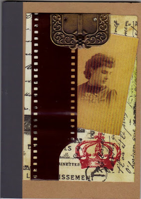
Now, what to do with these backgrounds? I used a piece to make this journal cover, embellished with a piece of film and a metal piece salvaged from a belt by my friend, SRC, who not only thought of it, but shared some with me.

For this card, I cut a heart out of the master board, tied some old twine around it and finally found a home for this old covered button. Printed out the sentiment and mounted on strips of master board. I inked a piece of corrugated cardboard to pick up some of the green ink on the background.
It feels good to be back - swirling with ideas!


I want to see that Etsy page! These are great-- I can't wait to buy some for special occasions!
ReplyDelete