Wednesday, February 22, 2012


We just spent some time in Montana with our daughter , SIL and  sweet granddaughter.  The Captain booked a romantic Valentine's Day get-away at Chico Hot Springs. He even had flowers delivered  - what I guy!  I have good memories of Chico; we've been swimming there with our granddaughter several times.  And once a real Montana cowboy asked me to dance with him at the saloon - a first for me on several counts!


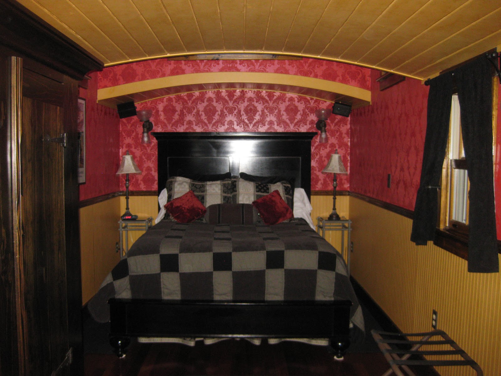
We stayed in The Caboose, an honest-to-goodness caboose situated on a ridge above the hot springs.  I wasn't sure what staying in a caboose would be like and never expected this:


The caboose was moved to the ridge in 2004 and gussied up for visitors.  I'd describe the decor as "Upscale Western Bordello" - beautiful cherry floors, antique furnishings, leaded glass windows, and  red-flocked wallpaper (that's the bordello component!).  The bathroom was lovely - complete with a heated tile floor:


The view  wasn't too shabby, either:


No visit to Montana is complete without a glimpse of elk.  These big guys were headed up the mountain past the caboose:


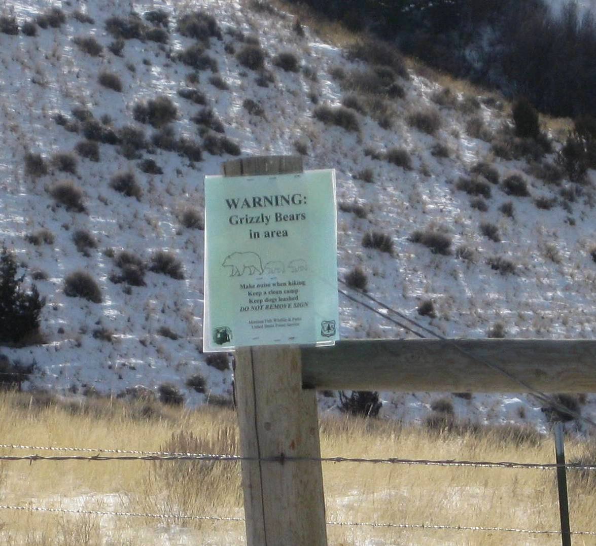
Elk are fine; bears - not so much!


Checked off the Bucket List - and all at Chico:  swam in hot springs, danced with a cowboy, slept in a caboose.


Wednesday, February 8, 2012

Rescued Canvas Family


"Creativity is allowing yourself to make mistakes. Art is knowing which ones to keep."
 -  Scott Adams

When I read Robyn Thayer's post about "embracing the suck" and what we can learn from making bad art, I knew exactly what she was talking about.  These sad little canvases have been on a shelf in my studio for over a year , mocking me every time I see them.  I had such high hopes; I even bought little display stands for them.  Somewhere between the concept and the execution the canvases veered off the track, firmly into suck territory!


It's rather embarrassing to share these, but there's no way to move forward without "embracing the suck" and there's plenty of that here!   Anyway, not quite sure what happened to these - clearly the colors don't work, the wavy texture doesn't work, the black swirls don't work, the red heart is wobbly, but other  than that, these are great - HA !

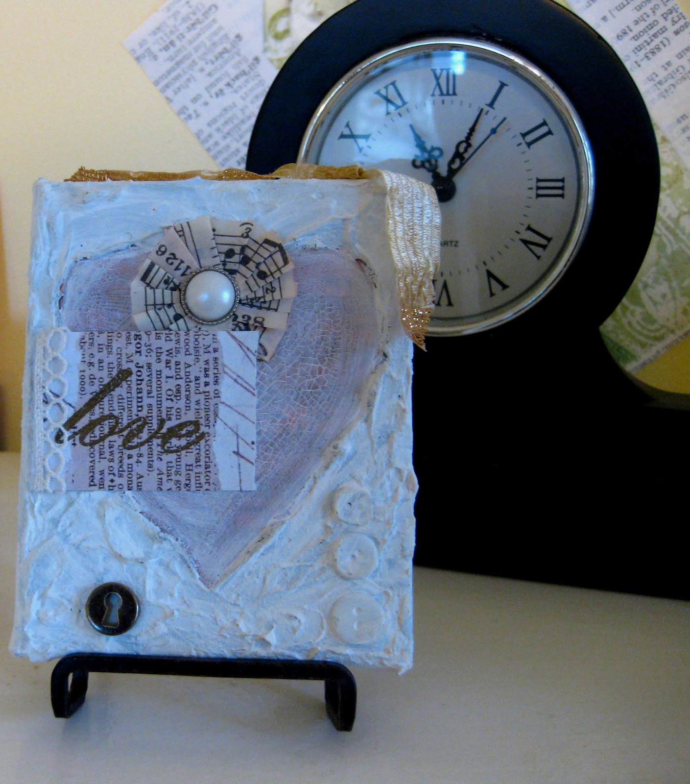
I couldn't throw them out.  After rescuing some artist papers with a wash of gesso, I decided it was time to stage a canvas rescue.  With just a couple of coats of gesso over the backgrounds, the canvases are already look so much better!


Starting with the formerly blue one, I washed the red heart with some gesso to tone it down more.  I added a rosette made with Tim Holtz tape with a pearl center.  I glued on a piece of text to some artist paper, stamped and embossed "love" and added a bit of lace.  One key hole and a bit of ribbon on top and, eureka! - this is more like what I had planned.


On to the next one - the scary purple one!  Again washed some gesso over the heart, then added a postage stamp, key hole charm and a jewel for some bling.  I pleated some more of the TH tape around one of the outside edges of the heart. The birdie is one of the resist canvases I blogged about earlier - love how the color wash makes the resist pop.  I rubbed some Tattered Rose Distress Ink around the edges to add a bit of color.


And the last one - more gesso, edges again rubbed with Tattered Rose DI.  I used a white gel pen to tone down the black stamped swirls and added a mirrored heart for some bling.  Layered on some stamped, DI'd flowers, a word cut from some artist paper and some ribbon on top.


Good lesson learned here - sometimes things just need some time to mellow and can be rescued from their formerly sucky state.  Of course sometimes things should go directly to the trash - no stopping, no collecting $200, no grace period.  Here's hoping I learn which ones go in each category!

Sunday, February 5, 2012

Goodbye, My Friend


I lost an old friend recently.   We were an unlikely pair.   I moved into an apartment in her farm house at 19, recently graduated from high school,  newly married and ready to start college.  She was 47, never married, a former egg farmer and an eccentric Yankee.    

Barbara  was a one-of-a kind woman.  She was handier around machinery than most men, made frugality an art-form, was a tidy hoarder, hated change, had a great, if slightly odd, sense of humor, could eat more than a farm hand , had very definite ideas about things, and would try most anything once.  She loved anything with a motor!  I can still see her riding the neighbor's snow mobile- her 6 foot frame crammed into the seat, legs bent to her chin, hair flying and a look of absolute joy on her face.

She had a wonderful  old Yankee way of talking.  She talked about having "gumption" - a trait she valued highly.  When I'd obsess about some minor imperfection, she'd offer this insight:  "Dear, it'll never be seen on a trotting horse".  

My oldest son and daughter were born while I lived in her house.  Carpenter Son followed her around the farm; she called him "Boy" and talked to him as if he were a grown-up. She was the one who scooped him up when he ran out into the busy road. She ate all of their cooking creations, even when I warned her not to!

I worked on dragging her into the current century.  Once while we were on a road trip I decided to go through the drive-up window at  McDonald's.  As I pulled up to the  window, she remarked ,"Dear, you're driving really close to the building" - she had never been through a drive-up window and never had fast food.  It didn't take long for her to become very fond of french fries!  We worked on updating her wardrobe so it would only be a couple of decades out of style.  While she didn't really care how old her clothes were, she was very concerned about how they fit.  I started making some dresses for her and honestly, I doubt The Queen Mother had as many fittings!

She taught me so many things - how to make the best-ever creamed corn, how to identify spots to harvest fiddlehead ferns, how to enjoy an entire Cadbury chocolate bar on the drive home from work at midnight, how being kind looks, what it really means to turn the other cheek, and how to dust yourself off and move on.

I think I began my fascination with  old and shabby  vintage things while I lived with her.  We'd spend hours going through old family photos - she knew how everyone was related, down to the "second cousin, twice-removed".  There were several outbuildings on the farm, full of stuff she knew would be useful someday.  I never knew that people repaired metal pails until she unearthed several and was not amused at my suggestion to just throw them out and get new ones.  This great window-turned-mirror  was from one of her chicken coops.  She did not understand why on earth I'd put it in my house!  I love it, not only for the great arched shape, but because it reminds me of her.


What really made her special was her kindness, her sense of humor and her reluctance to ever say anything bad about anyone. She gave life to the word "humility" and lived to help others.  She embraced me with all my faults, was a kind and loyal friend for decades, and I'll miss her.

Thursday, February 2, 2012

More Background Experiments


Here's another page from my 2012 calendars, continuing my focus on interesting backgrounds. This one isn't a new technique - all you Tim Holtz lovers will recognize it! The background is easy - smoosh Distress Inks - think 3 colors may be the maximum that works - directly on a craft sheet, then spritz with water. For this piece I used Lettuce, Broken China and Denim.   Drop a piece of card stock onto the wet ink and lift off. The spritzed ink makes am interesting background. If you end up with some blank spots, you can repeat the process BUT be sure to completely dry it first, otherwise you'll just end up with muddy colors. ( You know how I know this!).   Here's a link to Tim's video on this and some other easy DI background techniques.

Added a dictionary page, stamped with a TH splatter stamp, I love this stamp- it adds just a bit of interest and color. The pleated piece at the bottom is left over from the seaside page I posted earlier. These days I use my sewing machine mainly to sew paper.

Isn't the birdcage sweet! First time I tried the Prima resist canvas pieces and they are so cool. The cut-outs are white and when you spray them with a color wash, the canvas soaks up the color and reveals the white resist pattern. New obsession! There are available here online and probably in your local craft store ( although I haven't seem them at either Michael's or Joanne's).

I stamped the branch onto Grunge Paper, cut it out and inked it with Vintage Photo ink. The cardinals came from a great Snow and Graham paper.

Love experimenting with new techniques and stuff I have in my stash but never used before. That's why we collect all of it - you never know where inspiration may lead and what supplies you'll need when you get there!

Monday, January 30, 2012

12 Months of Christmas Project - January


I love making things for Christmas.  I don't love making everything in a three week panic mode, so I was motivated to join in on the project dreamed up by Aileen of Aileen's Musings.   She has put out a challenge to make something for Christmas every month and share our creations at the project site.

January's color suggestion is white - perfect for the project I had in mind - a white torn fabric wreath.

I started with a sad little thrifted wreath.  Since it was so puny I wrapped some batting around it to fatten it up.  The white batting also ensured that any gaps in the fabric won't be obvious.  If your wreath is not white and you don't need to fatten it up, I'd suggest spray-painting it white so the wreath color won't be obvious.


I used a bottom-weight white fabric remnant (about half a yard)  as I wanted some substance to the strips.  Tear the fabric in strips about an inch wide.  I made mine about 8 inches long, but yours may need to be longer or shorter depending on how fat your wreath is.  Better to start with longer strips and then cut them smaller if you need to. 

This couldn't be simpler - take on strip and tie in on the wreath.  I double knotted the strips and kept alternating where the knot fell on the wreath - some towards the inside, some near the outer edge to make it fuller.  If you like a more organized look, place all the knots lined up, but that kind of control makes me nervous!

Make sure your fabric strips are are close together as possible so there aren't any gaps.  Once all the strips are tied on , trim so the ends are fairly even, but embrace the chaos  - no measuring!

Since this is a Christmas wreath, a little glitter is in order.  I randomly brushed a bit of glue and sprinkled on some silver glitter.


Tie on a strip of fabric to make a hanging loop and you're finished. 

One Christmas project done - I feel so noble!

Wednesday, January 25, 2012

Another Pottery Barn Knock-Off


I love these numbered jars from Pottery Barn.  It dawned on me that I already HAD jars so making these would be easy and {gasp} require no new supplies!

Here's what I used:

Black acrylic paint, cosmetic sponge, stencil, tape and glue to secure stencil to glass.  Really simple project - decide where you want the numbers, tape on the stencil and sponge on black paint.  I tried some repositionable glue to help keep the stencil flat, but it didn't stick very well.  Taping kept the stencil secure and I just held down any areas that wouldn't stay flat.

The paint on the PB ones looks a bit scrubbed up.  My stencils didn't have  smooth lines and the cosmetic brush left a nice texture, so I didn't do any additional distressing.  If your stencil had really clean edges and your painting isn't textured, you could dab off some paint with a paper towel and scratch it up a bit with something sharp. 

Here are my knock-offs:

The jars are Burken jars from Ikea.  They  come in many sizes and have silicone inside the lids so there is a pretty decent seal. I use them for all kinds of storage.

Isn't the little guy  - "1/2" cute?  I smile every time I see it!  Love my new PB-inspired jar upgrade.

Sunday, January 22, 2012

A Little Decorating Magic

I like our flat screen TV but not how it dominates the living room.  Here it is shortly after moving in with too much TV and too much blank wall. 

I moved the ladder shelf out to make room for the Christmas tree and decided to start all over on the TV wall once the tree (sadly!) was gone. 

For starters, the big leather chair went into the corner.  Then added in a printer tray I had filled with shells and a frame with photos.  This frame idea is all over Pinterest and is so easy - staple some wire to the back of a picture frame and pin on photos. I used tiny clothespins to secure the pictures to the wire.


The corner looks so much more inviting now:


Now to the problem of what to do around the TV .   For starters The Captain helped hang a thrifted $3.00 shelf over the TV.  A few vintage and beachy items on the shelf magically shifted the focus from the big black box.


I made ATCs a couple of years ago for an alphabet challenge on Next Generation Stampers  that have  have been sitting in a box ever since.  They found a  new home in a 7 Gypsies display box, and one of my vintage drawer knobs made the perfect hook.  Has anyone decorated one of these boxes? Making the ATCs was the easy part - gluing them in was a bear!  I tried most of my stash of various adhesives without success.  Finally used some tacky glue - painted on both the box and the ATC with better luck, but still some edges going wild and free - grr!  Anyway, hung that to the right of the TV.


Now the TV is no longer king of the living room and pictures and artwork have found fun new homes.

Normal Title Italic

Follow Me on Pinterest

LinkWithin

Related Posts Plugin for WordPress, Blogger...
 
SITE DESIGN BY DESIGNER BLOGS